Announcing Uppy 5.0: headless components and hooks


The dog didn’t eat our homework, so we’re here to show you what we’ve been up to over the past year. We are proud to announce Uppy 5.0! Our faithful file-uploading companion has been attending all the training courses and is now equipped with the most requested feature of all time: truly composable, headless UI components. For years, developers have found themselves stuck between Dashboard’s kitchen-sink approach and the bare-bones drag-drop plugin, with little room to build something that fits just right.
This major release brings headless components and hooks to address those needs. Everything has been backported to 4.0 as well, so you can get going without the need to upgrade.
With Uppy 5.0 , you can finally build the exact upload experience your users deserve – modular, accessible, and tailored to your needs. Whether you need a simple file picker or a complex multi-source interface, Uppy’s got the building blocks to make it happen.
Building your UI: the need for something new
One size fits no one
Until now, developers starting with Uppy were forced to choose between either
the full-featured, bundle-size-heavy, and non-customizable dashboard or the
overly barebones drag-drop.
After years of talking to developers on GitHub and the community forum, and
feedback from Transloadit customers, the reality seems to be that the needs of
the majority of people fall somewhere in between dashboard and drag-drop.
Countless issues have been posted about users wanting mostly X, but doing Y
differently for their use case.
@uppy/dashboard has tried to accommodate some of these requests over the
years, which introduced overly specific “toggles”, such as
showLinkToFileUploadResult, showProgressDetails, hideUploadButton,
hideRetryButton, hidePauseResumeButton, hideCancelButton,
hideProgressAfterFinish, showRemoveButtonAfterComplete, disableStatusBar,
disableInformer, and disableThumbnailGenerator.
Continuing down this path is not maintainable, nor will we ever reach a set of toggles at this level of granularity to support a wide range of use cases and unique requirements.
Fake promises of modular UI components
We built status-bar, progress-bar, image-editor, thumbnail-generator,
informer, and provider-views as separate plugins. At first glance, these
look to be standalone components, but they are tightly coupled to dashboard.
It’s not impossible to use them separately, but there is little flexibility.
Modern expectations
Since Uppy’s conception ten years ago, the front-end landscape has changed significantly. Uppy is even built with a “vanilla-first” approach, because that was still popular at the time over front-end frameworks.
These days, developers have high expectations when it comes to choosing a library. In a world where everything is component driven, OSS UI libraries are expected to offer truly composable building blocks that are light on bundle size, and ideally keep accessibility in mind.
If Uppy is to stay relevant in the coming years, a major change is needed in the way we let users build their uploading UI.
Create the UI of your dreams using headless components and hooks
Uppy 5.0 introduces composable UI components and hooks that provide granular control without sacrificing first-class framework support. These components are designed to be lightweight, accessible, and fully customizable, while maintaining compatibility with React, Vue, and Svelte.
Uppy now offers three ways to build user interfaces:
- Pre-composed, plug-and-play components. Nothing new here. These are the
old
<Dashboard />and<DragDrop />. The downside of this option is that you cannot customize the UI. - Headless components 🆕 These new components are smaller, with styles that are easier to override. You can compose these together with your own components.
- Hooks 🆕 Use hooks to attach our logic to your own components. There are no restrictions. Enjoy the freedom to create a truly tailor-made UI.
When using the new components or hooks, you can use the
<UppyContextProvider /> to provide the Uppy instance to the components and
hooks.
- React
- Vue
- Svelte
import { useState } from 'react';
import Uppy from '@uppy/core';
import { UppyContextProvider } from '@uppy/react';

function App() {
	const [uppy] = useState(() => new Uppy());

	return <UppyContextProvider uppy={uppy}>{/* ... */}</UppyContextProvider>;
}
<template>
	<UppyContextProvider :uppy="uppy">
		<!-- ... -->
	</UppyContextProvider>
</template>

<script setup lang="ts">
	import Uppy from '@uppy/core';
	import { UppyContextProvider } from '@uppy/vue';
	import { computed } from 'vue';

	const uppy = computed(() => new Uppy());
</script>
<UppyContextProvider {uppy}>
	<!-- ... -->
</UppyContextProvider>

<script lang="ts">
	import Uppy from '@uppy/core';
	import { UppyContextProvider } from '@uppy/svelte';

	const uppy = new Uppy();
</script>
New components
All components come with sensible defaults, but expose data attributes for complete styling control. This approach delivers the flexibility developers need, while maintaining the plug-and-play experience Uppy is known for.
- UploadButton
- Dropzone
- FilesList
- FilesGrid
- Thumbnail
- ProviderIcon
Upload button with inner progres bar and conditional pause/resume buttons
Attributes
data-uppy-element="upload-button"data-state="init" | "uploading" | "paused" | "error" | "complete"
Drag-and-drop zone component for file uploads.
Props:
width?: stringheight?: stringnote?: stringnoClick?: boolean
Component for displaying a list view of selected files.
Props:
editFile?: (file: UppyFile<Meta, Body>) => void
Grid layout component for displaying files in a grid format.
Props:
columns?: numbereditFile?: (file: UppyFile<Meta, Body>) => void
Component for displaying image thumbnails and/or SVG icons.
Props:
file: UppyFile<Meta, Body>width?: stringheight?: stringimages?: boolean
Common icons, such as a webcam, device, Dropbox, Google Drive, OneDrive, etc.
Props:
provider:'device' | 'camera' | 'screen-capture' | 'audio' | 'dropbox' | 'facebook' | 'instagram' | 'onedrive' | 'googlephotos' | 'googledrive'fill?: string
Device
Camera
Screen Capture
Audio
Dropbox
OneDrive
Google Photos
Google Drive
Styling component states
Components expose their internal state through data attributes, enabling precise CSS targeting.
button[data-uppy-element='upload-button'][data-state='init'] {
	background-color: #3b82f6;
}

button[data-uppy-element='upload-button'][data-state='uploading'] {
	background-color: #f59e0b;
	cursor: wait;
}

button[data-uppy-element='upload-button'][data-state='complete'] {
	background-color: #10b981;
}

button[data-uppy-element='upload-button'][data-state='error'] {
	background-color: #ef4444;
}
New hooks
Examples are shown in React, but the same hooks are available in Vue and Svelte.
- useDropzone
- useFileInput
- useRemoteSource
- useWebcam
- useScreenCapture
Here is an example that uses hooks to exactly mimic the <Dropzone />
component.
import clsx from 'clsx';
import { useDropzone } from '@uppy/react';

type DropzoneProps = {
	note?: string;
	noClick?: boolean;
};

export function Dropzone({ note, noClick }: DropzoneProps) {
	const { getRootProps, getInputProps } = useDropzone({ noClick });

	return (
		<div data-uppy-element="dropzone" role="presentation">
			<input
				{...getInputProps()}
				tabIndex={-1}
				name="uppy-dropzone-file-input"
				className="hidden"
			/>
			<div
				{...getRootProps()}
				tabIndex={0}
				className={clsx(
					'border-2 border-dashed border-gray-300',
					'rounded-lg p-6 bg-gray-50',
					'transition-colors duration-200',
					{
						'cursor-pointer hover:bg-blue-50': !noClick,
					},
				)}
			>
				<div className="flex flex-col items-center justify-center h-full space-y-3">
					<p className="text-gray-600">Drop files here or click to add them</p>
				</div>
				{note ?
					<div className="text-sm text-gray-500">{note}</div>
				:	null}
			</div>
		</div>
	);
}
Create a file input button that opens a file picker when clicked and add the selected files to Uppy.
import { useFileInput } from '@uppy/react';

type FileInputProps = {
	multiple?: boolean;
	accept?: string;
};

export function FileInput({ multiple, accept }: FileInputProps) {
	const { getButtonProps, getInputProps } = useFileInput({ multiple, accept });

	return (
		<div>
			<input {...getInputProps()} className="hidden" />
			<button {...getButtonProps()}>Add files</button>
		</div>
	);
}
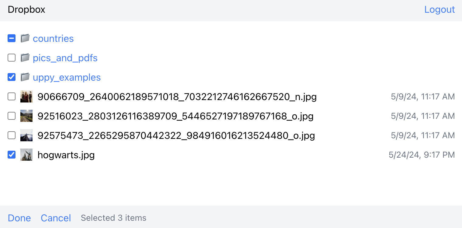
This hook can be used to build a UI for remote sources, such as Dropbox or Google Drive. It is a bit more complex than the other hooks, because remote sources involve more moving parts.
For this hook to work, you must have the
@uppy/remote-sources or the specific provider plugin
(such as @uppy/dropbox) installed, as well as a Companion
instance.
import type { PartialTreeFile, PartialTreeFolderNode } from '@uppy/core';
import { useRemoteSource } from '@uppy/react';

function File({
	item,
	checkbox,
}: {
	item: PartialTreeFile;
	checkbox: (item: PartialTreeFile, checked: boolean) => void;
}) {
	return (
		<li className="flex items-center gap-2 mb-2">
			<input
				type="checkbox"
				onChange={() => checkbox(item, false)}
				checked={item.status === 'checked'}
			/>
			{/* thumbnail, name, date... */}
			<div className="truncate">{item.data.name}</div>
		</li>
	);
}

function Folder({
	item,
	checkbox,
	open,
}: {
	item: PartialTreeFolderNode;
	checkbox: (item: PartialTreeFolderNode, checked: boolean) => void;
	open: (folderId: string | null) => Promise<void>;
}) {
	return (
		<li className="flex items-center gap-2 mb-2">
			<input
				type="checkbox"
				onChange={() => checkbox(item, false)}
				checked={item.status === 'checked'}
			/>
			<button onClick={() => open(item.id)}>📁 {item.data.name}</button>
		</li>
	);
}

export function Dropbox({ close }: { close: () => void }) {
	// The main hook that provides all the remote source functionality
	const { state, login, logout, checkbox, open, done, cancel } =
		useRemoteSource('Dropbox');

	// Show login button if not authenticated
	if (!state.authenticated) {
		return (
			<div className="p-4">
				<button onClick={() => login()}>Login</button>
			</div>
		);
	}

	return (
		<div className="w-screen h-screen max-w-3xl max-h-96">
			{/* Breadcrumb navigation */}
			<div className="flex justify-between items-center bg-gray-100 p-2">
				{state.breadcrumbs.map((breadcrumb, index) => (
					<span key={breadcrumb.id}>
						{/* ... breadcrumb rendering logic ... */}
						{breadcrumb.type === 'root' ? 'Dropbox' : breadcrumb.data.name}
					</span>
				))}
				<button
					onClick={() => {
						logout();
						close();
					}}
				>
					Logout
				</button>
			</div>

			{/* File/folder list */}
			<ul className="p-4 flex-1 overflow-y-auto">
				{state.loading ?
					<p>loading...</p>
				:	state.partialTree.map((item) => {
						if (item.type === 'file') {
							return <File key={item.id} item={item} checkbox={checkbox} />;
						}
						if (item.type === 'folder') {
							return (
								<Folder
									key={item.id}
									item={item}
									checkbox={checkbox}
									open={open}
								/>
							);
						}
						return null;
					})
				}
			</ul>

			{/* Action bar when items are selected */}
			{state.selectedAmount > 0 && (
				<div className="flex items-center gap-4 bg-gray-100 p-2">
					<button
						onClick={() => {
							done();
							close();
						}}
					>
						Done
					</button>
					<button onClick={() => cancel()}>Cancel</button>
					<p>Selected {state.selectedAmount} items</p>
				</div>
			)}
		</div>
	);
}
This hook can be used to build a UI for the webcam plugin.
You also need to install @uppy/webcam and initialize it on the Uppy instance.
import { useWebcam } from '@uppy/react';

export function Webcam() {
	const {
		start,
		stop,
		getVideoProps,
		getSnapshotButtonProps,
		getRecordButtonProps,
		getStopRecordingButtonProps,
		getSubmitButtonProps,
		getDiscardButtonProps,
		state,
	} = useWebcam({ onSubmit: () => {} });

	useEffect(() => {
		start();
		return () => {
			stop();
		};
	}, [start, stop]);

	return (
		<div className="p-4 max-w-lg w-full">
			<ErrorDisplay error={state.cameraError} />
			<video
				className="border-2 w-full rounded-lg data-[uppy-mirrored=true]:scale-x-[-1]"
				{...getVideoProps()}
			>
				<track kind="captions" />
			</video>
			<div className="flex gap-4 flex-wrap mt-4">
				<button
					className="bg-blue-500 text-white px-4 py-2 rounded-md disabled:opacity-50 disabled:bg-blue-300"
					{...getSnapshotButtonProps()}
				>
					Snapshot
				</button>
				<button
					className="bg-blue-500 text-white px-4 py-2 rounded-md disabled:opacity-50 disabled:bg-blue-300"
					{...getRecordButtonProps()}
				>
					Record
				</button>
				<button
					className="bg-red-500 text-white px-4 py-2 rounded-md disabled:opacity-50 disabled:bg-red-300"
					{...getStopRecordingButtonProps()}
				>
					Stop
				</button>
				<button
					className="bg-green-500 text-white px-4 py-2 rounded-md disabled:opacity-50 disabled:bg-green-300"
					{...getSubmitButtonProps()}
				>
					Submit
				</button>
				<button
					className="bg-gray-500 text-white px-4 py-2 rounded-md disabled:opacity-50 disabled:bg-gray-300"
					{...getDiscardButtonProps()}
				>
					Discard
				</button>
			</div>
		</div>
	);
}
This hook can be used to build a UI for the
screen-capture plugin.
You also need to install @uppy/screen-capture and initialize it on the Uppy
instance.
import { useScreenCapture } from '@uppy/react';

export function ScreenCapture() {
	const {
		start,
		stop,
		getVideoProps,
		getSnapshotButtonProps,
		getRecordButtonProps,
		getStopRecordingButtonProps,
		getSubmitButtonProps,
		getDiscardButtonProps,
		state,
	} = useScreenCapture({ onSubmit: () => {} });

	useEffect(() => {
		start();
		return () => {
			stop();
		};
	}, [start, stop]);

	return (
		<div className="p-4 max-w-lg w-full">
			<ErrorDisplay error={state.cameraError} />
			<video
				className="border-2 w-full rounded-lg data-[uppy-mirrored=true]:scale-x-[-1]"
				{...getVideoProps()}
			>
				<track kind="captions" />
			</video>
			<div className="flex gap-4 flex-wrap mt-4">
				<button
					className="bg-blue-500 text-white px-4 py-2 rounded-md disabled:opacity-50 disabled:bg-blue-300"
					{...getSnapshotButtonProps()}
				>
					Snapshot
				</button>
				<button
					className="bg-blue-500 text-white px-4 py-2 rounded-md disabled:opacity-50 disabled:bg-blue-300"
					{...getRecordButtonProps()}
				>
					Record
				</button>
				<button
					className="bg-red-500 text-white px-4 py-2 rounded-md disabled:opacity-50 disabled:bg-red-300"
					{...getStopRecordingButtonProps()}
				>
					Stop
				</button>
				<button
					className="bg-green-500 text-white px-4 py-2 rounded-md disabled:opacity-50 disabled:bg-green-300"
					{...getSubmitButtonProps()}
				>
					Submit
				</button>
				<button
					className="bg-gray-500 text-white px-4 py-2 rounded-md disabled:opacity-50 disabled:bg-gray-300"
					{...getDiscardButtonProps()}
				>
					Discard
				</button>
			</div>
		</div>
	);
}
Putting it all together
Here you can play around with the new components and hooks in all three frameworks. These examples are also available on Uppy’s GitHub.
- React
- Vue
- Svelte
Give feedback
It is still early days with the new components and hooks and we are looking for feedback to improve. Don’t hesitate to reach out to us!
Export maps for all packages
All packages now have export maps. This is a breaking change in two cases:
- The css imports have changed from
@uppy[package]/dist/styles.min.cssto@uppy[package]/css/styles.min.css - You were importing something that wasn’t exported from the root, for instance
@uppy/core/lib/foo.js. You can now only import things the packages explicitly export.
Changed imports for React, Vue and Svelte
Some components, like Dashboard, require a peer dependency to work. However, since all components were exported from a single file, you were forced to install all peer dependencies – even if you never imported, for instance, the status bar component.
Every component that requires a peer dependency has now been moved to a subpath,
such as @uppy/react/dashboard. As a result, you only have to install the peer
dependencies you need.
Before:
import { Dashboard } from '@uppy/react';
Now:
import Dashboard from '@uppy/react/dashboard';
Deprecations
Merged UI plugins
@uppy/status-bar and @uppy/informer have been merged into @uppy/dashboard.
These components have always been tightly coupled to @uppy/dashboard and with
the advent of the new headless components and hooks, we want to go all-in those
components and remove the confusing, inflexible ones.
Old plugins
@uppy/store-reduxcan be recreated by consumers, should they need it.@uppy/redux-dev-toolsis no longer needed.@uppy/progress-bar,@uppy/drag-drop,@uppy/file-inputand are superseded by the new components and hooks.@uppy/aws-s3-multiparthas been merged in@uppy/aws-s3for over a year now.
Overhauled tooling
As the components started to age, so did our tooling. We put a lot of effort into migrating to a more modern monorepo setup.
A fun example is comparing the
before
and after of our
package.json.
- Instead of global build scripts with lots of conditionals for packages, every package now has its own build script.
- Use the TypeScript compiler instead of Babel for transpiling.
- Introduced Turbo for faster builds.
- Migrated from Cypress to Vitest Browser Mode.
- Migrated from Eslint and Prettier to Biome.
- Migrated from our custom release tooling to Changesets.
- And more smaller clean ups
That’s all we have for you today! We hope you’re excited to play around with this latest version of your favorite file uploading companion that loves to play fetch, and doesn’t chew on your shoes.